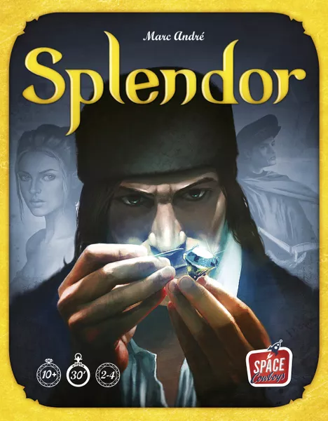
One of the things that makes game design incredibly difficult is that, unlike traditional linear media, you have little control over the experience of the person interacting with it. However, you can put all the pieces down, and guide them aesthetically and procedurally towards the intended experience. One classic example that comes to my mind is the board game Splendor.
The TL;DR of this is game is that you are gathering “prestige” by buying, selling and trading precious stones. The visuals give the player the feeling of being a prestigious collector - travelling far and wide and making deals to get the most valuable gems you can get your hands on. What really pushes this experience are the procedural elements; a lot of the game involves mental calculation and scanning the board for the next gem to buy or work towards.
What ends up happening in the game is that the table is dead-silent.
Whether it was the intended experience or not, it’s certainly an interesting aspect of the game, but thematically it fits into the design of the game. Picture a gemstone dealer sitting silently in a dimly-lit basement making frantic calculations and scanning their paperwork to find the next big deal they can make. It works beautifully with the game as a whole.

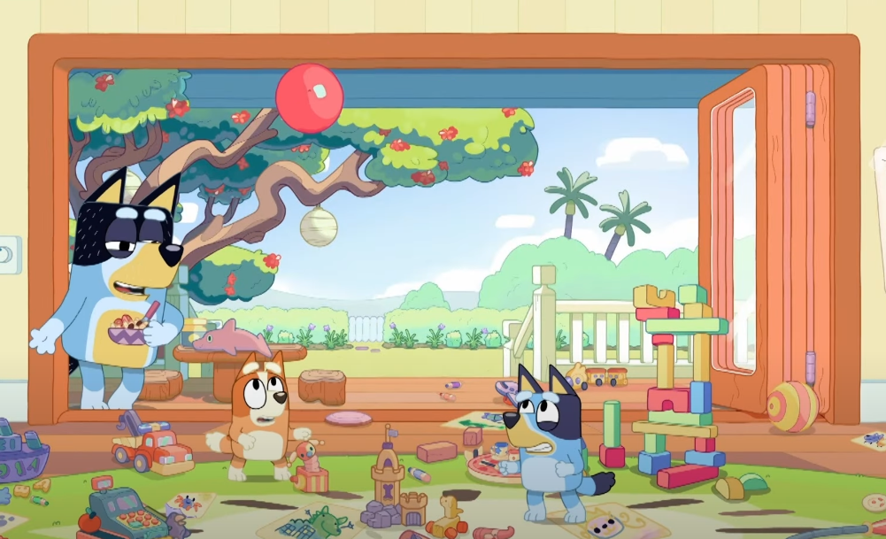
I thought to myself though, how to capture this? Over the Christmas holidays I was playing the game Keepy Uppy with my 2-year old. It turns out it’s a big thing in the Blueyverse but I recall playing this as a child. The goal is simple - keep a balloon from touching the floor. I thought it would be nice to try and capture this as a relaxing and zen experience rather than the frantic flailing of limbs it so often is.

I set to work to create a basic 2D game where you click the balloon to keep it from falling off the screen. One stylistic method I took was that all transitions in the game are gentle fades to and from white. This gives it a kind of ethereal quality. All good games need a goal and conflict, so I introduced these ’targets’ that players have to get the balloon onto, where each target gives a point. Similar to the scene transitions, these targets fade in gradually and when collected, gently disappear into the background.
The colour palette is cold and calming - various shades of blue, white and purples for outlines. When the balloon falls off the screen, it gently fades to white and the player is brought back to the menu. When the game starts, they are given instructions and some time to scan the screen and understand what is required of them.
As for the conflict and difficulty curve of the game, I have gone through several iterations to introduce challenge. One thing I found when playing was that I really enjoyed the goal of trying to get the balloon into the target with a single push - it was oddly satisfying watching it fly up and then hover down right onto the target without any intervention. I introduced a multiplier system where each time you do one of these “hole-in-one"s it would increase the multiplier and give you a better score. However the experience started to become stressful and anxiety-inducing, not to mention disappointing when the multiplier was reset and I missed out. This is especially tough as the targets are randomly generated so often there would be absolutely no way I could even get the balloon to the target in a single push. It was actually kind of infuriating - the system (I built) was out to get me!
Another iteration was making the score for each target a function for how long it takes for the balloon to reach one target to the next. This had the same effect! Frantic clicking to get the balloon to the target. Not the zen I was after.
Back to the drawing board. I introduced myself several rules for this kind of experience I wanted to create:
- No time limits
- No rush to get more points
- No pressure to maintain “performance”
Instead I have opted for:
- Different variations of the target to keep things interesting. Things like smaller surface areas, moving targets etc.
- Environmental disruption - wind, other balloons which can push the player out of the way.
These things create conflict without pushing the player. They can happily bounce the balloon up and down or mess around with it to avoid the obstacles. Similarly, the introduction of wind can be both a blessing and a curse. The player can experiment with it to try and use it to their advantage. What is interesting overall, is how the rules and procedures of a game can influence the mood and experience of it - its easy to forget that the play experience itself is a huge contributor to the overall vibes you get as a player, putting aside any notions of visual or sound design.
Anyway, I will provide more updates to this as it’s been a fun project and delve into calming design. It’s in a draft state on itch.io and I’ll share more when I am happier with it :)